Thursday, September 29, 2011

New Deborah Lippmann's

I managed to order the latest polishes from Deborah Lippmann, plus a spare to get free shipping. I'm a big believer in free shipping...I might spend more than I would have if I'd not boosted my order to get it, but at least I get something for my trouble. I'd rather pay another $18 in this instance, for another polish than $8 for shipping. I can actually keep and use the polish.

Needless to say the new Lippmann's are absolutely beautiful, and so completely different from one another!

First up, I offer you Glamorous Life, a lovely "rose gold", as it's described on the website, which is a lovely metallic. It's surprisingly opaque. I really expected it to be much more sheer. That is a nice surprise! I'm not fond of sheers, they tend to show every single flaw in my nails. This is, however, not sheer. It's actually a two coater!

Pretty isn't it? I expected it to be darker, but it's a lovely metallic pale copper, a rose gold, just as advertised.


Two coats, not a hint of nail line. I like this, it's a delicate pale gold, the pink in it makes it kinder to my skin tone than a straight gold would be.

Just one more! See the shimmer? So lovely! And completely work appropriate anywhere, I would think. It's a little different but still subtle. 

The second from the new Lippmanns is Good Girl Gone Bad.  It's...well, check it out:


OOOOO. I know, right? This doesn't even do it justice. It's SUPER sparkly. It dries super fast because it dries matte, though. See the pinky there?

Click on this and look at it larger to see better. It's actually a little less amethyst than this. These first two pictures are without flash. GGGB almost has a black base....it also dried a bit rough. It wasn't my favorite look, really. I had to top coat it.

This one shows the particles at least, if not the glamour of this. It's beyond sparkly. 

Here's a top coat pic:


That's a bit better! However...not so much amethyst in real life. It's more fuschia. It's really beautiful. I'd pick this one up! This went on sheer, though. So odd. Wouldn't you think this one would be the opaque one? Nope. You want two thick coats or at least three thinner ones. It's a clear base with this micro sparkle. It's not glitter by any stretch.

To round out my free shipping I picked up Bring on the Bling. I was honestly not that sure about it. It's a sheer, which I've just said I don't like that well and that it has real diamond dust in it seemed almost pretentious. However...it's pretty and pretty is what we are ALLLLL about!


Once again, this doesn't do it justice. The index finger is showing the true nature of this.


Oooo. But it's still not quite accurate. The diamond dust actually makes this flash in several colors, it's really gorgeous. It would make a great top coat over something really dark to spice it up.

Now we're talking! Pretty! This is two coats.

This just makes me want to squeal like a little girl. Look at that. It's...**shrugs** how do you describe it?

Oh yeah. Pretty great.

This one went on well and while it dried fast, it didn't seen to have that dull quality. I should have top coated it just to see what would happen but honestly, I liked it so much I didn't feel the need.

Of course all of these applied like a dream and were easy to handle. The Cheeky Monkey didn't stand up to dishes, but I don't blame it. I did a crap job applying it so it could just as easily have been that.

Next up will hopefully be some more of those Orly Mineral FX polishes. I figured out the upload problem. It was dumb! But now I need to figure out what's missing from where I store the photos so...never ends with that collection!
I'm currently sporting the gorgeous and original butterLondon Bluey. Yum You will be seeing that soon. I'm currently destroying it while typing...duh. But it's really pretty. Peacock sparkly. Hells yeah!

I hope you like these as much as I do!

Happy Talons!

Wednesday, September 28, 2011

A-England - Free World-Wide Shipping!

I haven't swatched my whole A-England collection because...well, as you guys may know, I tend not to swatch a lot, though...readers like it so I do do it at times. It's fun for me, too. BUT, I know there is a lot of blogger buzz on the A-England polishes and I confess, I love them as well. Gorgeous colors, easy application, good wear...I mean, look up my post on Iseult if you're curious about wear! Freaking wouldn't die! And stayed lovely until I finally took it off, too. No yellowing, no bad chipping...great, great polish.

So, I wanted to alert you to the fact that they are getting ready to launch their second collection and they are having Free World-Wide Shipping! If you're curious about them at all, this is a good time to check them out. Shipping from England can be hella expensive. Take advantage to save a little and try a new brand, why don't ya?

Here's a swatch of my collection, in the bottles, obviously, just to give you a taste. It's a seriously delightful and fun line, and I think if you try it you will love it as well. And yeah, I'm posting it so they are all good on animal cruelty.


Why are you still here? GO! ORDER! Now!  :)

Happy Talons!

Monday, September 26, 2011

Update on Orly Emberstone

Hm. I finally threw in the towel on this beauty. Wear just wasn't what I expected from an Orly. Orly is generally the BMWWU's favorite polish brand. This didn't live up to that, unfortunately. It was weird, though. You'll see that here. I'll point it out because...it's just odd.

See the thumb? Now see everything else? Not really any tip wear...so weird. It either came off in a piece or it didn't come off.

See? There's a little tipwear on the pinky and middle fingers, the ring finger has none and the index...well, that's a deal breaker in my world. Off it came.

This isn't horrific or anything...but it's disappointing. I guess I just expected more.

Beautiful color, though...Hm. I'll wear it again, but not if I'm planning to wear it for long.

Happy Talons!

Sunday, September 25, 2011

OMG, why won't these swatches upload???

OK, guys. I'm still fighting with the Orly swatches. I do not know what the freak is the problem. I get very vague messages like...network error. OK. I am getting some up, though, so hang in there...I may only be able to do a color at a time, which is not what I wanted. I feel like I cheat you guys when I do that. I wanted to post this whole collection. Maybe this is the fates telling me...nahhhhh!

OK, so let's talk about Emberstone because I'm wearing it, and all the swatches I took of it actually did load.

This is a gorgeous shimmery coral. It has quite a lot of red in it and a lot of sparkle, of course, that's the hallmark of the mineral polishes. It dries smooth, so no worries there. This is actually a fair representation of it...please don't mind the over-spray. I wasn't apparently feeling very careful when I did these swatches! OOPS!

Here you can see where the orange comes in, which is partly what makes this so complex. It looks good on me, too, which is cool. I'm still wearing this, I wish I could say it's wearing well...given the amount of swatch trouble I've been having with this collection, I don't have a wear swatch up yet, but I will try to get that done for you before I take it off. I also have a split I need to deal with so this may as well change at that time as it's chipping.

It's so pretty, though!! See the hot pink flash? Yeah...I'm not sure you're going to notice that...let me see...


THERE you go! Now it's pointed out! And look what I learned, I can do cute rounded edges as well! Likey! Here too, you can see the gold, which..honestly, I kind of expect to see in this color family. Silver would just look...dirty, I think. It does lend it some fire, I have to say.

OK, so...the pink flash. That shows up on the nail. It's not a bottlephenom. 

I know I got a swatch of it somewhere...


Not really, but you can see kind of what it does here. It softens things up, gives it a je ne sais quoi sort of quel'que chose...

Here you can kind of see it on the index and ring fingers particularly. See that hot pink in there, in the sparkly? Yeah. Pretty sweet. It adds a shot of unexpected and takes a sparkly coral and makes it slightly mysterious and fascinating. This swatch also does a good job of showing the glass fleck sort of arrangement they have happening here. SO pretty. See the hint of purple as well? Cooooollll.

This color is so wearable, as well. A coral...that's pretty standard stuff. It was the go-to polish after they figured out women would wear something besides red. There are a lot of really pretty ones out there, don't get me wrong, and I do wear corals quite a lot. It's BMWWU's favorite. I am always on the lookout for a hot new coral just for her if not for any other reason.

In some lighting though...as you can see, this looks really pretty red. It looks red right here in this last swatch...It's red, it's orange, it has pink flash, purple flash (you can see that in this swatch, too. Maybe all my swatches should be vaguely fuzzy...don't think so!), gold sparkly...it does it all.

Emberstone, indeed! I like. I just wish it were wearing better, which I will try to show you tomorrow night.

Kinda depressed about it really, because typically a sparkly lot of goodness like this will wear and wear. This hasn't. Sad. But I guess it's just an excuse to go ahead and wear a different one, huh?

Pssstttt....yeah you! Come here! **whispers** That's why we're polish hounds. Chips are just an excuse to wear a different color!

I hope you like as much as I do!

Happy Talons!

Friday, September 23, 2011

Next on Deck

I have swatched and have some wear thoughts on the new Orly Mineral FX collection, which I loves. I had to hit two separate Sallys, across town from one another mind you, to score this whole collection, but it was so worth sitting through that one light THREE times. And bonus, they were on sale.

However.

Ever notice there is always a "however"?

The uploads are being just painful. I have some great swatches...but getting them up where I can use them is proving to be challenging to say the least. I am exhausted, which doesn't help matters, does it?


So. Maybe I will start this project with the first I actually wore. I am wearing another right now. They're gorgeous, seriously. I feel like I say that about everything, but...these really are pretty amazing.

So Let's take a look at my probable favorite, which I had to get on my nails right now, RIGHTNOW!


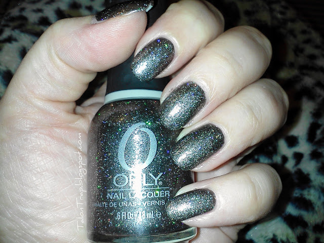
GAH this is a terrible color to capture. This is what it looks like, only dumbed down. It is a dark grey, gunmetal sort of color. This is not a jelly. The thing is...see all that sparkle that's making it look like a ManGlaze? It's not really silver. Some of it is, I suppose, but most of it is HOLO. Yes. That's right, lads. Holo. It's gorgeous. It reflects the light and it dries smooth. Pretty cool, eh?


Yep. That looks an awful lot like Goth right there, which it is not. Not even...no. First off, it's not black. Second...those silver particles are holographic and every color under the sun. I have to be able to do better than this.


K...that's a little better. Blurry in sunlight...yeah, yeah...


Ow. That's giving me a headache. Quick! Before you look away, see the colors? See that? Now imagine that exponentially more intense. THAT would be Rock Solid. I loves it.

OK, so it wore well for the 4 days I had it on. Some tip wear but nothing you couldn't fix. It goes on pretty opaque and covers well. This is two coats. I didn't notice any drag on it, so it was pretty easy to apply and like I mentioned, it dries nice and smooth. No bumps. Coming off was a whole other matter. It was like Studio 54 at the nail salon. Oops!


I am trying out a new top coat, I'll review that separately once I've played with it more. It's really meant for a UV light, which I didn't realize and don't have. It seems to be doing OK.

What do you think? What to check out this collection?

I intend to swatch the whole collection together soon, probably for Saturday's post. I really like it! I hope you will like it as well so you'll buy it and encourage Orly to do some more of these fun polishes.

Happy Talons!

Thursday, September 22, 2011

Deborah Lippmann Stormy Weather with Narcisco Rodriguez

The last of the Deborah Lippmann Fall Collection is Stormy Weather with Narcisco Rodriguez. It's a slate grey cream, like the color of wet concrete. It went on beautifully, as to be expected, and is richly pigmented.

Pretty, huh? There is a dirtiness to the color I kind of like. This has no top coat on it, that's it's natural sheen. Lovely.

Here is another shot, I took this with the flash on and then dummed down the exposure because it turned out WAY lighter than this is really. This is close:

It has quite a lot of blue in it, which gives it a  bit of something extra from a standard grey. This color is pretty complex for a straight up cream.

Also pretty close to actual, but with different lighting.

It's a striking color. I am wondering how this would compare to the darker greys in the Nubar Fortress collection...I didn't think of that before. Maybe I will have to try that comparison!

Happy Talons!

Wednesday, September 21, 2011

Illamasqua Faux Pas

Ooo. Saved my fave for last. Illamasqua's Faux Pas from the Theater of the Nameless collection is a lovely purple. It's just purple. It's not royal, it's not lavender. It's purple. I love it. Same rubberized finish as the others and just gorgeous.


Don't mind the bubbles there. That was actually not bubbles (Rolled not Shaken chick!) that was a piece of the felt things I use to remove my lacquer with that got stuck to my nail and I didn't see it. That's not actually bubbles. This applied with the same easy coverage as the rest of this collection.

Here's another shot:

And oddly, I only have these two pics. Strange, because I really love this. It's slightly dusty, the rubber finish keeps it soft, it's edgy but really wearable...Truly a great. Love.

Happy Talons!

Tuesday, September 20, 2011

Deborah Lippmann Billionaire

Deborah Lippmann Billionaire is part of her new Fall color collection and it's dark, dark green. There is quite a bit of black in this I would say. It's the darkest color of green in a camouflage print. It's the darkest green of the ink used to print money, hence the name.


Here in this swatch you can see what I mean about the black. If you are looking for green you'll find it. If you're not...you won't. It's really very dark.

It's not QUITE this dark in real life, but it's dark.This is a straight cream. It covered nicely. I believe this is two coats. I need to take notes. It performed for application as one would expect from Deborah Lippmann. Smooth, creamy, nice to handle and good coverage with good pigmentation.

These two were taken without a flash on. This is close...

With a flash...whole other animal!


It's not this grassy in person. It's somewhere between these two.

Then I got to thinking...do I have another interesting comparison with the Illamasqua Kink?

HAHA! Yeah, no. Not even close. This bottle shot is very true to life, though. See the Army sort of dress greens color to this? That's really what I would equate it to. There is an olive tone to it, but not entirely. I would actually equate it to...spinach! Yes. Don't let that turn you off. If you're looking for an edgy dark olive green, this is your bottle.

It's a great color. I'm not big on greens, but this is pretty enough. Not my favorite, I don't think, but what do you think?

Happy Talons!

Monday, September 19, 2011

Illamasqua Vice - and a surprising comparison

Illamasqua Vice, my next offering from the Theater of the Nameless collection, is a lovely red plum. No, really. It's the color of a red plum. I really like it a lot. I'm oddly fascinated with it. It has the same rubberized look to it and I'm still loving it.

Isn't that pretty? It looks like one of those colors I would use to a nub from my Big Box of Crayola crayons. I have a lot of pics of this because I love the color, I love it on me...Why not swatch it into oblivion?

 Isn't that gorgeous? It's a plummy red...it's so pretty and look what it does to my skin! It brings out the alabaster, which I love. No. I do not tan. I don't care who doesn't like it.

It's a lovely creme and like the rest of this collection, it went on thickly, but easily. See how tidy the cuticles are? Once again, I'm not really that good. The polish was just easy to manipulate.

So...I'm looking at this and I'm thinking...this looks like a plummier version of Deborah Lippmann Single Ladies. Hmmm. I had to try it. Check this out!

Um, wow. They are definitely not the same color. However...If you want the shiny look, just flat prefer Lippmanns, or want something just a shade redder...Deborah Lippmann's Single Ladies will do ya for a color similar to Vice. Obviously, the index finger and part of the ring finger are Single Ladies. I have one more shot I think is pretty telling:


How about that? The Lippmann looks a lot richer here, but it does have the shiny finish and it's over Vice.

Surprisingly similar, don't you think? Do you think you'll pick up both? This was a shock. I think if I hadn't swatched both of these collections at the same time I would never have picked up on this. So interesting.

Happy Talons!


Sunday, September 18, 2011

Manic Panic Hellfire Wear

We already know that Hellfire is AWESOME. I wanted to put in a short update to let you know how it wore. AWESOME.

I do finally have some significant chipping. It's been days now. Personally, I think this isn't bad after about 5 or 6 days of wear, especially as I did not reapply top coat.

This is a tad blurry, but you can see the wear. It also does a pretty good job showing off the sparkly goodness!

See, this is completely fixable, if you want to take the time.

I won't be afraid to try this brand again, not by a long shot. I have 3 other colors, but there is a whole other line. My understanding is the ones I have are from last Halloween's collection, which is cool. Some really fun stuff comes out at Halloween!

Happy Talons!

Deborah Lippmann Single Ladies - Heh, Draw Blood

Deborah Lippmann's Fall collection is full of deep, dark, brooding colors. Single Ladies is hardly the least of these. It's red. Blue red, blood red...take your pic. It's intense, it's brooding, it's deep. I wouldn't call it dark. It IS sexy.

Hm, in the light of the flash, this could definitely have used another coat, don't you think? I believe this is two but it may be one. Everything I swatched that night went on so beautifully. Not a huge help to you guys, but keep in mind that as these are swatches, I didn't bother with a base coat so a good base coat/primer might settle this question immediately. I did not mentally note any application problems so I think this Single Lady just needs another coat of polish.

This almost has a red plum feel to it, doesn't it? It's really amazing. I do love this color. But see what I mean? Blood red. Gorgeous to be sure, but slightly dangerous. It's so pigmented, so rich...mmhmm. This is a keeper, to be sure.

Here's another shot:

Don't mind the cuticle there...oops. I might have been getting tired by this time. I did a lot of paint paint paint, remove remove remove that night.

This is a straight up creme. There isn't anything else happening in there. No hidden sparkly, no glam except it's innate glam! This is 1940s Joan Crawford-Norma Shearer in The Women (the real one, not that debacle that came out a couple years ago) cat fight red. If that movie hadn't been in black and white, for the most part, this would be the pivotal Jungle Red!
I'm not romantic about nail polish. Who? Me? **rolls eyes at self**

Love.

What do you think? Picking this one up or do you have enough reds? This is beautiful and I love it, but if you dig...you might have something similar. It's not setting the originality wheel on fire, but you know what? You don't always need original. Sometimes you need classic. This is classic.

Happy Talons!

Saturday, September 17, 2011

Illamasqua Taint - Tainted Love

The next I'm swatching from Illamasqua's Theater of the Nameless collection is Taint. I have a love hate relationship with Taint. I'm not the biggest fan of brown. Unless it's a pelt on an animal walking around? I'm probably not going to get gung ho. I'm not all that gung ho on Taint, either, but...I think you will see what I mean when you see this:

How do we describe Taint? The word DIRT comes to mind. Poop...that's another one. It's...brown. However...look at it on my skin tone. Let's try this again:

Um...yeah. It actually looks good on me. For...dirt. It has that rubber finish to it that I think I love. It's a non-committal mid-point between shine and matte. I like it. I think it lends a softness to the polish. You can top coat this collection if you want, and honestly, having the ability to do that with these gives you three separate colors in each bottle. You can slap a matte top coat over it and dull it completely, which I don't have. You can put a Seche over it and get a glossy polish, which I didn't do, or you can leave it as it is. I know Scrangie did do that, so you can take a look at her swatches. She is not a fan of this finish, but I rather like it. A rare time when I differ with Scrangie's opinion!  (By the way, she's great. Go see her blog, but please don't leave mine! :D )

This is two coats. Like Kink, this tends to go on thicker and opaque. I generally find that one coat is cheating and you end up sorry if you do. Two is my norm and I know a lot of the bloggers out there will do three. I kind of do two and see if I think 3 will help me.

Here's another shot:


See...that not really chocolate brown looks good on me. I'm not sure I like the color, it just doesn't really appeal to me. I thought this would be more taupe for some reason. I rarely even buy brown clothes or shoes...my one nod to brown is smokey topaz...it's simply not to my taste, but...this does look good on my pale alabasterness.

What do you think?

Happy Talons!

Friday, September 16, 2011

Deborah Lippmann Brick House

Deborah Lippmann Brick House is part of the new Fall collection. These have been out about a month or so. I did post bottle pics when the haul arrived, but I didn't swatch. Well, now I have.

This is a really lovely copper metallic. It's not so much brick, which I associate with red, but instead a metallic terra cotta? It's really gorgeous. It's very wearable. Here's a better swatch:

I believe this may have been only one coat...Judging by how thin it looks in the first swatch, it might be. I know I had two lacquers that I swatched that were one coaters. This may have been one. A second and third coat sure won't hurt it, if it was. This is so stunning, and so wearable. It's a tricky color for some skin tones, having that much orange in it. Mine should be one of those, however, and it's not.

It's not frosty or shimmery, that is just the metallic finish to it. It's probably my favorite of the Fall collection. They are all beautiful, of course, but this is lovely, lady like, but still a little edgy. It's definitely Fall but I see no reason this can't come out in the Summer and Winter, too.

So...I know when I did the bottle shots I did a comparison to Illamasqua's Shrapnel. In the bottle they are so different. Shrapnel looks more pale, softer, pinker...I had to try it anyways.
This picture really shoes the differences in the bottle colors, but the nails...not so much. You can see Shrapnel is pinker here.

Let's try that again.

Ah. Here we go. This is pretty true to color. It's a tad washed out...and don't ever punch someone like this, you'll break your thumb. I just didn't paint the thumb nail so I hid it. These have about the same kind of metallic finish. Shrapnel leans more towards a foil. They are in the same color family, to be sure, but Brick House is darker, redder, while Shrapnel, denying it's rather fantastic name, is pinker, softer and more delicate. They are both gorgeous. I would say Brick House is a more true copper while Shrapnel is the color of rose gold. And they both look good on my super white skin, which normally rejects anything passing for orange. I just wear oranges anyways!

So what do you think? Brick House, totally beautiful? I think so too.

It went on nicely, like a Lippmann should. You're paying top dollar for it, it better go on nicely! I think this was two coats, to be honest. I think I took that first swatch and slapped another coat on. It's two coats of Shrapnel as well. Both polishes apply so nicely. I can't complain about either brand, honestly.

I think when it comes down to it, if you love this color, get a hold of both of these. They are different enough. If you like this color then I'd choose one, purely on your own preference or skin tone. These are top shelf lacquers with top shelf prices, and I confess, if I hadn't purchased Shrapnel some time ago, I would likely have not bought both. That, my fellow polish hounds, is up to you!

Happy Talons!!