Showing posts with label A England. Show all posts

Thursday, November 8, 2012

Deborah Lippmann Porn - Holidays 1

Deborah Lippmann has already started putting out her holiday collections. Everywhere. I find this irritating? Because I don't want to set up accounts all over God's little green acre to get polish. I don't. However. That said, they are so gorgeous that I often end up doing it. But it doesn't leave me warm and fuzzy. Especially since none of these places are ANYWHERE near me. I have to shop online. Which I admit, I prefer because crowds irritate me even more, but it's a lot like shopping at the mall when you have to go to Barney's, Nordstroms, Neiman Marcus, etc. And then they all start sending you emails. Gads. Thank the Velociraptor for spam filters. No, I don't want a really unattractive pair of boots made by some poncey designers for a ridiculous amount of money. Stop asking. Just let me know when the new polishes are in and then bugger off. 

So I hit up Barney's. Which according to one blog I read on all these collections, was only supposed to have one of them, not most of them. I think the only one they didn't have there was the Nordstrom exclusive which, let's face it, will likely be mine before long because I have a problem. I know this. You know this. It's why I write this. So that it's not all going to waste on me. 

Well, and MDAMO, who enjoys this with me because he's wonderful and sweet and tolerant. **huggles, sweet man**

The next Lippmann Porn I'm presenting you with is The Millionaire's Holiday.


Now. If you have been reading up on the Forsaken sets I have been showing you and kind of complaining about the boxes, maybe this will elucidate that whole rant for you. Well, not rant, but mention, definitely. This is a really nice gift box. It's about the color of a newly patinaed brass, it's heavy, it's substantial and it feels nice in your hands. It perfectly showcases the colors while protecting the bottles.

Open it up and there is a nice touch inside:


There is a little Happy Hollidays with some kisses from Deborah. You can see on the edge, this is a nice box. Is this silly? I suppose it is in a way? But when you shell out the money to buy these it's just a nice touch. It's like finding you've bought a sweater whose tag is on a ribbon and attached with a little safety pin. It suggests quality. So much more so than some mass produced plastic thing. Yes, of course I know these are mass produced. Do you get my point at all, though? We know we're paying for packaging as well as product. When I pay this much, it doesn't hurt to have my quality product in a quality package. It makes me believe they care and they recognize that I'm investing in them and their product because I believe in it enough to pay a higher price. It's a little thank you.

On to the polish.

Sexy Mama. This is the color I was particularly excited about. I don't wear a lot of red, MDAMO isn't a huge fan of red, but I do have quite a bit of it. It's a classic, you can't really go wrong with a nice red. With all the colors we sport on our tips these days, red seems almost retro at times, don't you think?

Gads those silver labels are a beeyotch to photo. I apologize if I'm blinding you. If I don't use flash you can't read them.

Now...hold up. As I was swatching these I was like...wait a minute. I think I have something similar to this!

Mmmhmm.This is four colors because after I realized I basically had a dupe on my hands, I tried the other red Lippmann has out for this season Through the Fire. That's on the pinky. It's definitely distinct and I think I prefer the color on me, though all FOUR of these are gorgeous. Can you tell them apart?

Here's another shot:
Yes, there is some miniscule difference. Not dramatic though, and certainly not enough that if you were looking at these three in a store that you would be having a debate. You'd go with the price you like, or the brand you like and call this a day.

You're not going to pick up all three. But like I said, I don't wear a lot of red. I like it, I will wear it, but unless I'm in the mood it's not going to be a go to.


One more. One has more gold, one has more blue, but...Wowzers. Not a big difference here.


The first bottle comparison. butterLONDON Knees up and Deborah Lippmann Sexy Mama. They look more different in the bottle than they do on the nail.

Without flash the difference is so small. Hardly worth mentioning. The Lippmann is half a hair darker. To which I say Big Woo.


The other red is A-England Perceval.

The bottles rearranged for a difference comparison.

So I say, unless you collect reds, collect Lippmann's or you don't have Knees Up or Perceval? Then go ahead with this set. Or if you JUST HAVE TO HAVE one or both of the other colors. Don't get it for just this color because frankly, you can do it as well and cheaper elsewhere. I will say this, the Lippmann was a one coater. That is one coat up there, which is very impressive.


The same comparison shot again. This is what they are going from top to bottom:

Sexy Mama (index). Knees Up (Middle), Perceval (ring), Through the Fire (Pinky)

 Moving on, a polish so completely distinct that maybe it's worth the dupe for you. It's the color of money with some gold thrown in for good measure and it is dazzling. Now we're talking. And not surprisingly, this is called Easy Money, because it does bring that ink to mind. You know, the ink the US dollar is printed with. Ever look at it up close? There is a lot going on. This is amazing. I sure don't have a dupe for this.

Wow. This is two coats. And look at the perfect cuticles! Easy to control and excessively easy on the eyes. This one is a fascinator.

Lastly but not leastly:

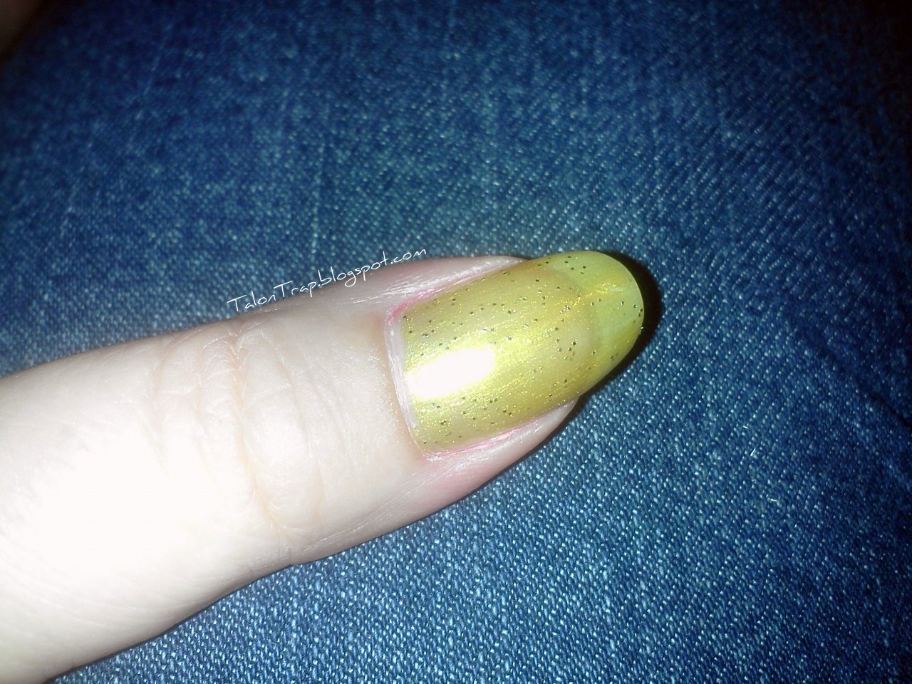
Wow. Yellow greenish gold. There is green in here, you can't deny that, but it's a lovely gold that would have been great for my Goldfinga post! I just didn't have it then. Gold metallic with something slightly dirty about it. Love it, even though it doesn't actually look that flattering on me. It's kinf of a hard one to wear. Two coats again for this, and look at the perfect application. I can't take all the credit, the polish helps. So does the brush.

This one is From Rags to Riches, as you can see, and it's lovely. This is a non-flash picture so you can see what it will really look like. It looks a bit more brown here, which is definitely in the color. But not dingy. It's very pretty. Striking. I don't have anything like this one, either. 

Funny how the one you were looking forward to disappoints you sometimes, while the ones you were meh over are the ones that end up impressing. 

I hope you enjoy and I'd love it if you tell me whether you're picking these up or not. This one is not available on LippmannCollection.com at this time. I got this at Barney's.

Happy Talons!


Monday, October 15, 2012

GoldFingaaaa!

Yeah...I was raised on James Bond. My father was always a big fan. It's watching those movies with him that I learned I wanted to be either Bambi or Thumper, I wasn't specific, and that the Aston Martin HAS to be the coolest car in the world.
Though I am somewhat happy that the new Bond wears an Omega rather than a Rolex. I like that Omega isn't as...Rolex as Rolex. I personally rock an Omega, so....

If you read the same article as me about the anniversary of James, though it is a week late, and I do apologize for that, but all the same. You know one way to celebrate the man, the myth, the martini is to be fearless in a gold manicure. so I am here to give you some gold options that are available out there and you can easily get, and hopefully I've found something for every skin tone.

Just please keep in mind that I don't actually look good in gold. I don't look BAD in it. I just don't look good in it.

These are from left to right: A-England Holy Grail, butterLONDON The Full Monty, Cherimoya Boo 2012 Collection Gold Glitz, Deborah Lippmann Nefertiti and on the thumb China Glaze Champagne Bubbles from the 2011 Christmas collection.

I did check on these and they are all available online, incidentally. And each nail is two coats on a bare nail, no prep or anything.

There is a better picture of the China Glaze coming up. I recognize, of course, that you can't really see it here.

Here they are again, reverse order: Nefertiti, Gold Glitz, The Full Monty and Holy Grail. As you can see...all gold, all distinct.

China Glaze Champagne Bubbles. It is gold shimmer with a gold glitter. It's prettier in real life, the flash and lighting are making this more yellow than it actually is.

This is, left to right: Chanel Delight and Catherine Arley 807. The Chanel is more a rose gold, but I think on it's own it might be very true to a real gold.

A different angle on those. The Catherine Arley has that lovely holo effect that is nearly non-existent in regular lighting, but it adds depth.

All BondJamesBond aside, an antiqued gold is all the rage this season so this also may help you know which direction you want to go if you're interested in that look. As I said, I don't feel that gold is flattering on me so I only have these few and one or two others that I couldn't find for purchase online. Still won't do that to you. Just won't.

What do you think? Are you shaken or stirred? :D


Happy Astons!

Sunday, August 26, 2012

Wet n Wild Comparisons

So I brought my little stash of Wet n Wild home in my tacky plastic Walgreen's bag and set them out on the floor to take pictures to show you and thought...hold up. I think I've seen some of these before!

I don't really do comparison posts. Partly because there are other bloggers out there who do them better and partly because what I think looks like something else really kind of...doesn't.

But I know that in these times, when money is scarce and food prices are only escalating, that if you can get close to a more expensive color you might just do it, if you knew what to look for. Some of these work, some of them are fails. Hopefully the are all food for thought. Each swatch is one coat just to show quality, opacity and color.

Here is the starting line-up:


 The two in the upper right are just part of the stash and I have a swatch of each to show you because they are really fun.

Hollywood Walk of Fame over Illamasqua Collide. I was taking Collide off when I decided to do these comparisons and I left it on. This turned out to be kind of educational and I may use this idea in the future. Nothing shows you streaky polish quality like something aggressively clashing under it. You will see what I mean later on.

This is a clear top coat with star shaped glitter in it and it is SO fun. I love it. You can see the stars are really pretty large, they're all the colors and they're densely packed in there. These Fergie ones have the large brush in it. I know there is a lot of hate out there for the wide WnW brush, but let me tell ya, when it comes to chunky glitter it's kind of an asset. I don't mind it. **shrugs**


 New Year's Kiss on Illamasqua Collide. One coat. this is sparkly silver tiny glitter and holo string glitter in a clear base. You can see the glitter is pretty dense and there is a lot happening. It dries a little rough so you want top coat on both of these. 

On to the comparisons!

Wet n Wild Fergie Rock n Roll is a sparkly charcoal thing. It's really pretty and it really sparkled but I said...wait, now. I have seen something like this! I dug through the Orly's I have out *embarrassed* and yes. Very close. Orly isn't really a luxury brand, but if you're shopping for them at Ulta or Sally or somewhere that isn't cheap and online, you can pay a price. These Mineral FX polishes were even more, though I do not remember how much more. I remember there was something of a small uprising about it. If you feel the same way, here is your answer. While none of these I will show you are complete dupes, some of them are dupe enough. I would say this one is. For $3.49, unless you compare and contrast with an Orly Rock Solid on someone else, you're not going to see the difference.
More on these two later because this is a polish look I really love.

Several of the WnWs I bought  reminded me of butterLONDON's. I don't know if it's just I love what butter does so I am attracted to those same kinds of colors at Wet n Wild or if Wet n Wild is deliberately aping some shades done by butter. It's not a bad idea. Take your lead from a more cult brand to bring those kinds of colors to a mass of consumer who probably aren't even looking at the more expensive brands. It's a sound strategy, if that's what they are doing.


This is Wet n Wild Dutchess and butterLONDON Scouse. No, they're not exact, but they are very very close. The difference is in the quality. Scouse does have that hot pink sparkle in it that Dutchess has, it's just not showing up here. Look at the nails...Middle is Dutchess, Ring is Scouse. See how much smoother Scouse is? Also, it's clearly in a rich clear helly base. I'm not sure what Dutchess is doing.

Scouse has more of a glass fleck to it while Dutchess is more of a scattered mico-glitter, and it is chunkier and dries rougher. The butter is a smooth one. Like...butter. **groan**

However...in the world of color, which I think Scouse is the better made polish, I am not that fond of the chunk there, it just looks messy, I think in another layer or two, these would be close enough. Definitely not dupes. But close enough. A way to get the look for less, here. At $14, butters are up there compared to many and way over the $3.49 price point. For $10, I'm sure some of us can tolerate a little chunk.

OK, here's where I went astray but not as far astray as I will later! This is WnW Miami Heat and butterLONDON Slapper. Never gonna pass for each other, no way. This is with flash and it's making it a bigger difference than it really is, but it it shows of the shimmer in Miami Heat nicely. It's a really pretty polish, actually, and it went on beautifully. butters streak on the first coat and level on the second, we know this. It's a characteristic of the brand. I'm willing to live with it, personally. I usually do at least 2 coats regardless just for better wear.

No flash, just glare. the butter is much more blue and turquoise. These look very close in the bottles but go on a bit differently. Still, depending on just how blue that turquoise has to be for you., Miami Heat is really pretty and a lot less money. They won't ever be confused with each other, but this is a nice way to get a similar color. However, if you just need that blue in there, then go for the butter. I did. :)

WnW Teal of Fortune and butterLONDON Bluey. Damn Close. Once again, the butter is more of a glass fleck with a nice smooth finish while the WnW is more about sparse glitter but the base colors are really almost dead on. Not the same polish, not saying that, just saying it's a way to get a trendy look with a little less investment. They are distinct but the base colors are so close. You could substitute Teal of Fortune and be very happy with it, I think. If you've been lemming the butter but can't swallow the price, go for Teal of Fortune. But save up for the butter. The smoothness of it is worth while, I feel. However, they are both really very pretty. I don't think there is a bad decision here.


Next I thought...maybe. Just maybe. AEngland Galahad and WnW I need a Refresh-Mint. Or maybe Buffy the Violet Slayer to butterLONDON HRH.

This is why I don't do comparison swatches.

Really? OK, to be fair to me, these are the same color family. Galahad is a lot darker. you don't really need me to tell you. If you want the look and are OK with it being a lot lighter, Refresh-Mint will do ya. But it's a total compromise. I would point out, though, the quality. This is on a bare nail, obviously, and note the streaky thin look of the WnW as opposed to the consistently excellent AEngland. No real contest. However, in a few more coats Refresh-Mint is going to even out and behave and be very pretty.


Buffy, on the other hand, is a total WTF was I thinking?
Next to HRH Buffly looks blueberry. There is no contest here. Once you got Buffy on the nail it became so much more blue than it ever was in the bottle. I knew it was more blue, but...THIS much?

So for grins and giggle I dug out Deborah Lippmann's Private Dancer. Yeah, no.

You'd be better off choosing the butter over the Lippmann if cost is your only concern. Possibly WnW has a purple that can go toe to toe with these two. but I don't have it. HRH and Dancer are two very different polishes, I would never ever ever call them dupes, but if you want a rich royal purple, HRH will do just fine for a little less. It lacks the chrome finish of Dancer, but it's not meant to have it.

Now here's a comparison I bet doesn't get made every day. This is the newer version of Happy Birthday, which is the only one I have, Wet n Wild Fast Dry in A Party of Five Glitters, and Forget You.
Looking at them in the bottles I would have ruled out Happy Birthday. It's simply not as dark. Not the case!


Interesting. OK, so we can rule out Forget You. It's a hot mess in one coat and it's a sheer black base. Not int he running, but...Birthday and Party...well, now.

Are they dupes, no. But once again, if you're the only one in the room wearing it no one would ever know. Only a true polish hound is going to even question it. And worse yet, the WnW went on easier! I think, again, it's that tremendously huge brush. It picks up more polish, more glitter and it distributes it more easily. Plus, the WnW was a bit thicker so the glitter stayed put better. Happy Birtdhday was a little more difficult and a little more sparse going on. You can fix sparse but...For the money, unless you just HAVE to spend the extra $17, get the WnW. I know Happy Birthday is practically legendary and it is beautiful and it is higher quality, but if you just want the look, because let's face it, not many of us are getting away with this at work, why would you do it? I did it because I didn't know about Wet n Wild and I assumed it was not cruelty free, which it is.

And they both suck equally coming off so...not a factor.

One last shot of those. You can see the differences but I say if anyone is looking that closely with an attempt to say "CHEAP IMITATION" then you need to just poke them in the eye.

So those are my bargain suggestion for some of the trendy right now colors and some classics as well. And some fails. But the fails are useful, too. Maybe it will spare someone a frustrating thought they had a passable color and they do not moment. As I run into things I will try to post more. I'm all about saving money and making cruelty free easier and more appealing to everyone.

Happy Talons!!

Sunday, July 29, 2012

A-England Dragon

MDAMO decided green. I sent him tons of pics of different greens that I have, which really wasn't tons. I don't have a lot of greens. Some. He wanted GREEN. So we found Dragon. He was taken with it instantly. I took it to my manicure and BMWWU skrinkled her nose and didn't say much else and then when it was done informed me that it "looks nice with that ring". I think she didn't like it. She said it was the color of moss. Which...it's very true.
I liked it.

Dragon is a nice dark-ish shade of grass green. It's described on A-England as:
"Like sunlight glinting off his iridescent mossy green scales, the fearsome Dragon lays basking arrogantly, awaiting his due."

I took this in the salon before it was even dry. You can see the holo particles in it here. It has such an interesting look to it. 

It did have some brush issues, the bristles were not all even. BMWWU took the tweezers to it and pulled those out and then had a brush she could deal with. it went on nicely, no problems. It's pretty highly pigmented, as you can see. The green is really rich and lush in it.

Unfortunately, I don't have a bottle shot for you, it would seem I left it at the salon. I hope I did. This is one of those that goes out of stock on occasion. It's in stock right now, but it has been out in the recent past. In other words, this one is popular!
Here you can see the holo particles in all their glory. This is with flash in sort of natural light. It's sunlight through the window but it's not direct to my nails.

Same lighting here. You can see it's just beginning to show signs of wear. This is EIGHT days old now! 8!! As in, more than a week! It wore like iron. To be fair, I wasn't doing any dishes because I badly burned my right hand and had a big blister. I even had to call my hairdresser and beg her to please wash my hair. It's been an adventure. As a result, this wasn't put through the same level of paces as usual, but it still had to survive my job, which is no mean thing. I barely survive my job.

OK, a bit blurry. And you can see part of the ENORMOUS bandage I had covering my burn. So sick of those things! But you can see how this lights up. It's seriously gorgeous. If you like green this is a good one.

In direct sunlight. The driveway shot! Isn't this pretty? Look how it's picking up the light but also reflecting the black behind it. This has depth. I think it's love. 

The right hand in the sun. So gorgeous. This looks darker because all the light it's picking up in the holo shimmer, but it's very true to color.
Whoa. Where did the green go? This is the same polish, I promise!

OOOO. This is it. This is the real deal. Super close up in the sun. You can see some tip wear on this hand, but it's not bad, especially not for 8 days.

As it compares to the fir tree in my back yard. Very close! That is new growth so if you're curious to the true color of this, go check out a fir tree!

Last one. This is my dog! Isn't she fluffy? :) I don't know why I took this. I just did, she was there...it does show off the color nicely, though.

So I don't really remember the mechanics of this. It was a manicure and I honestly didn't pay a lot of attention. I know we tried the new top coat I got for free. I don't know if it's cruelty free or not so until I find out I won't tell you what it was, but it may have contributed to the amazing wear I had with this polish. It's so pretty and wearing like that just ups the notch on it. A-Englands, in my experience, wear amazingly well. I know that gels are the new hot thing, but if I can find a polish that wears 8 days then I'm probably using that instead of a gel!

What do you think?

And is it wrong that I keep thinking of Charlie the Unicron. No, I really mean Unicron. Youtube it! LOOK! There's a DRAGON! Behold the horror.

Enjoy!

Happy Talons!

Thursday, June 28, 2012

A-England Ascalon

Photo heavy post, be forewarned. I took a lot of pictures and I deleted about a third of them. You can thank me any time.
I had to take a lot of pictures because this is amazingly beautiful. For once I actually managed to really capture the color, the holo the everything. And I did it well and I did it a lot. I think this is more a testament to how beautiful this polish is than it is my photography skills, which, if you haven't been noticing or you've been reading this blog in braille, is limited at best.

Ascalon is part of the latest A-England collection called "The Legend". They are mostly holos, which I love. Ascalon is described as

"Forged by magic and guided by our hero's sainted hand, the steely grey of his spire is alive with a swirling heart of lavender fire." On the A-England website here: Ascalon.

Check it out. I pretty much know you're probably adding it to your cart and buying it as soon as you see it. 

This was right after I painted my nails. I think this may not even be dry yet and you can see I hadn't cleaned up yet. This is what you're going to see in every day lighting, at your office, etc. Gorgeous, right? "Steely grey" is right, but look at the sparkle in there. It looks like silver micro-shimmer but it's not. If you look closely you will see flashes of that lavender, which is a flash in the polish. I can't even begin to start drooling on this. I don't know where to start.

A kinda blurry one to show off the sparkle. We're still not really seeing it, though. I was actually on IM with a male friend of mine **waves** who is the soul of patience with my girlie habits. He actually will converse with me about nail polish and encourages me sending him pictures and seems genuinely interested. If not interested then indulgent. If that isn't dedication to male/female relationships I don't know what would be. Regardless, I was taking these to send to him so he could tell me if he liked it or not. He liked it. Not as much as another one I will likely have to wear shortly, but he liked it. So there you go, a male opinion. 


Still just what you will see in ordinary lighting. That's my leg. I was at my desk trying to send pictures of what my nails were doing and not really getting it right. Not bad, you can see that lavender again here, which just adds so much depth. Holo AND flash? I think I just suffered a nail lacquer la petite mort.

If you don't know what that means, look it up. I said it en Francais for a reason.

 Oh. Holy. Jesus. 
Yes.
This is what you really get. Look at that. There are no words. Or at least I don't have any. 

I know, right? Couldn't you just die??
Be forewarned. This is what you will see while driving in the sun shine. Please be careful. Wear gloves if you have to. I would hate to think anyone wrecked because they were hypnotized by an absolute beauty like this. And yes, you will see this much brilliance in some lighting. This is just the camera catching the right angle from the ceiling fan light. Honest. The polish really is this lit from within, this holographically brilliant, this amazing. It really, really is. 


Last of the indoor lighting shots, here is a bottle one. It's not actually this dark...but it is, kinda. This doesn't show the lavender flash, which seems more prominent in the bottle than on the nail but you will see in the sunlight pics that it's really not the case. The lavender flash is definitely there. 

OK. I know. This is terrible, really. I had some kind of schmata on my lens, but I held onto this picture because of the obvious flash on the pinky nail. You can really see it here. This was outside approximately 6 days after the initial manicure, keep that in mind in the future pics. You will see what 6 days of untouched A-England wear looks like. Not a lot! It's enough that I'm planning to change this manicure tonight, but it's not bad!


Very similar picture sans schmata. Nice, right? Minor tip wear, nothing glaring. Right hand looks as good. Look at the brilliance, here. How can you not love it? (I'm looking at you, BMWWU. How can you not love holos? Well, and you too, Ruby Slippers. (Flash freaks her out a little.))
Love the Hollywood smile stars from the sun catching the shimmer particles in the polish. Couldn't have staged that.

The label. I take these as much as a reference for me as anything but I take them so you may as well see them as well. The holo is slightly more pronounced in this picture.

I happened to notice that at this angle the polish showed itself brilliantly so I took the picture that way, and let me tell ya, at 96 degrees, that blacktop is freaking HOT. However the camera didn't get it. This does serve, though. It shoes how densely packed and glowy the particles in this polish are. This is really highly pigmented and the second coat was probably more to just even it out and intensify it, and honestly habit, as anything. One thick coat of this might do you just fine. 

There's that lavender goodness.

**Wipes drool off chin**

I do heartily love this. 

That's all the wear after about 6 days? Hello. What's not to love. In my experience these wear so well. Go check out my post of Iseult if you don't believe it. I thought that would never come off. 

OK, last one. It's just so bloody fascinating. Every color in nature is in there, I swear. I just want to stare at it. 

Mechanics, because really, I don't know what else I can tell you about it. Look at those pics. That is about all you need to know!

1 coat Poshe Nail Strengthening Treatment Base Coat
1 coat Nailtiques 2 Plus
2 coats Seche Rebuild
2 coats A-England Ascalon
1 coat Poshe Top Coat (Fast drying)

Love love love love love.

Happy Talons!