Showing posts with label Plum. Show all posts

Saturday, January 12, 2013

Urban Decay Naked set

You have probably already heard that L'Oreal is looking to purchase Urban Decay. Hopefully they have not already and it doesn't go through because in my world that means no more Urban Decay for me. I know the argument is that you should still purchase from animal friendly brands who are owned by animal cruelty companies to show them that Look! We will buy the stuff you don't test on animals! However...in my opinion, you are still putting money in their pockets and I just can't do that. Not purchasing anything from them knowingly sends a stronger message. Is it tougher? Hell yes. I happen to be fortunate that I can get my bath soap and sundries from someone who makes it in her kitchen. No animals harmed. Shampoo too.
I don't know. Follow your conscience.

I ran into these quite by accident while trolling Sephora. I also got a couple Ciates to get up to free shipping, one of which I have on and will review for you later. (Teal. Pretty. Want to do a couple comparison shots to another teal or two.)

The now legendary Naked eyeshadow pallet is a lovely collection of neutrals. If you haven't picked one up yet, I'm shocked. They are perfect work friendly colors all in a nice little set that is varied enough to keep your look from getting boring while not cluttering up your makeup space and storage. Urban Decay, knowing they're on a big wave with is, have released another set of eye shadows and now these polishes.

These are minis, come in a cute little case, more about that later, and are similar to the eye shadows, only there are fewer of them. I am not writing this from my usual digital perch and I did not edit the photos from there, either. I think they look a little washed out, I'm hoping that is just a difference in video cards and settings and that they look better than I think. Please humor me if they really do look washed out. These are all two coats.

This is picture heavy. On a set this large I would break it up but I'd lose you all. Bear with me.

This is in the annoying plastic box. I hate that plastic stuff. Show of hands: who has cut themselves on one of those. **raises hand**

Out of the box. Nice glare, I apologize. There is a nice variety of neutrals here, not all beige. Shimmer, micro-glitter, creams, metallics...they are all here.

The classically fun names. Particularly loving "Creep". Does that mean "To Creep, as in creep along" or does it mean "Creep" as in "That guy who stalks you at work"? I think it's up to you.

Naked is the most bland of the group. It's just a creamy beige. It's not bad on me, surprisingly. Usually this type of color gives me lobster paws.

 Cute little bottles. 

Sidecar is a very sheer nude shimmer. The shimmer is dense, it's not eaten alive by the base color, which has a pearlescent quality and it going to take a ton of coats to make opaque. When they are this sheer I always wonder if they intended it to ever be opaque. I dunno.


This is truer to the actual color. There is a real dusty rose pink tint to this which makes it very wearable. 

Bet you are wondering what this looks like over Naked! I immediately wondered that, too.

This is a really great bottle shot.
This was a better nail shot. Naked is only on the first two nails in these swatches so you could see the difference. 

 Toasted is the peach side of the spectrum. It has that lovely shimmer in it, it's very neutral but not boring. Definitely work appropriate. 

This is really lovely, I liked this a lot. And it appears to like me, too!

Coppery bronze goodness. This might actually be my favorite of the group. It is so highly pigmented it wanted to clump up. Just keep the brush loaded and be careful. The gold shimmer in this makes it so sexy. Love.

It looks lit from within. I really love this one. Lit from within...ironic as it's named Smog!

It was Smaug that made me love dragons. I know...ubergeek.

This is my other favorite. Hustle is a dusty plum and it's so pretty. It's also one of those deeply pigmented colors that manages to look good on anyone. It has a real metallic glint to it from the hint of silver...this is so so pretty. 

A little closer look. It wanted to clump up as well, but just keep smoothing. It'll be OK. This is unique, I don't think there is anything else quite like it in my collection, which is impressive. Not bragging, actually kind of embarrassed, but all the same. There is something smoky and intriguing. If this kind of color were available when they were doing film noir, the sexy vamp who hires the detective but is in on the game would have worn this. Not red. Red's too obvious. This would have been the color to offset her expensive black French cigarettes.

Creep is a deep black jelly with silver micro glitter. It doesn't try to be anything else. It's really pretty, really striking and really a pain to apply. This balled up worse than any of the others. I got it...but it took effort. I had to remove it and reapply on one nail. There is a lot of pigment in that black base, but it's not a cream. You can see where it's thin on sections of my nails that it isn't. 

This is a really good shot of it. I have a better label shot as well coming up next because I couldn't choose. It was like one showed off the nails, one showed off the bottle. Blah.
This isn't that unique, there have been a few of these lately. Orly Goth is coming to mind, and it's easier to apply. However, this is a nice addition to all the beigy neutrals so I am not going to complain too much.


I haven't been to Ulta in about a thousand years, but if you're interested in this set, I want to assure it's safe to have it delivered. The box is not hollow, it's foam. I have a shot for you:

The nice thing is you could probably wing this 40 feet into a wall and nothing is going to break. The bad side is that you can't get the freaking bottles out. I pried mine out with a pen, explaining those little dents in the tops of the spaces. They are really in there. It's also not hard to store. There isn't a lot of wasted space and it's pretty thin. 

So, while it's still cruelty free, I wanted to show you this. Now we'll go back to our regularly scheduled program of leftover Christmas ideas and the last (!!) Deborah Lippmann exclusive set. Which is still available because I think a lot of people never knew about it. More on that in it's own post!

Happy Talons!

Tuesday, November 20, 2012

The Return of Deborah Lippmann porn - Forsaken Reforsaken

I picked up the last Forsaken set I was interested in a couple of weeks ago. They were on the main website, are listed as limited editions and MDAMO, loving darks as he does, really liked the polish. I don't wear a lot of lipstick...I HAVE a lot, but I don't often wear it. I'm a lip biter, I tend to chew it off before I even get to the car. I love it, I love how some of it looks and how it makes my lips feel, especially the better stuff. So...the lipstick was interesting but not the reason I bought it.

Regardless, I knew I had better get it blogged so I don't break my promise to you readers to not tempt you with stuff you can't get by normal means.

Here's what you get:

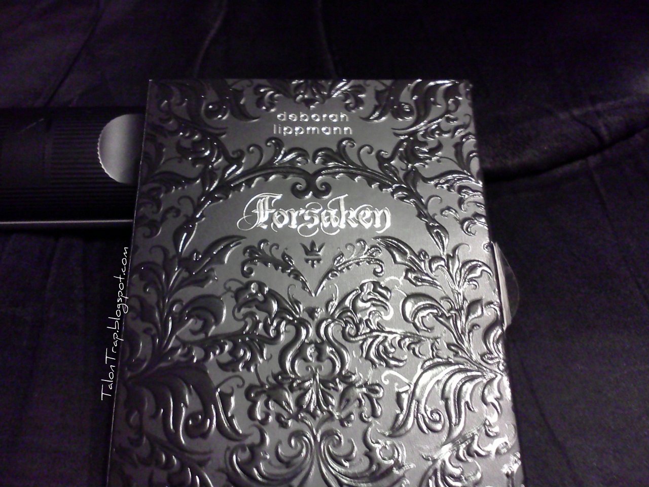
It comes in this heavily embossed box, which is pretty and appropriate and ever so slightly creepy. The thing that looks kind of like a tab sticking out of the upper left corner is actually the remote control I propped the box on to allow me to get a decent picture. Ignore that. That messed with my eyeballs for a good long while before I figured it out. Derrrr.

It opens in a book and everything is nested inside, complete with a little note about the sets.

The lipstick, aptly named "Bite Me", which is also scented, had a blush on it, like a chocolate that has gone too long in the wrapper. It smells of chocolate, which is both nice and odd.

I swatched it on my wrist:

 It's a really pretty brown berry color, I would guess would be very flattering on many of us. It's creamy and applied nicely. On my wrist. I have not actually worn this.

 Here's a close up of the tube. The packaging kind of annoys me, I wouldn't want to pull this out at a nice restaurant and be flashing my vampire geek girl status. But then again, I wouldn't pull this out at a nice restaurant because I was taught putting lipstick on at the table is tacky, but you know what I mean. I like a nice anonymous lipstick tube.

Plus...I kind of think a lipstick tube should be a little sexy...I don't know why.

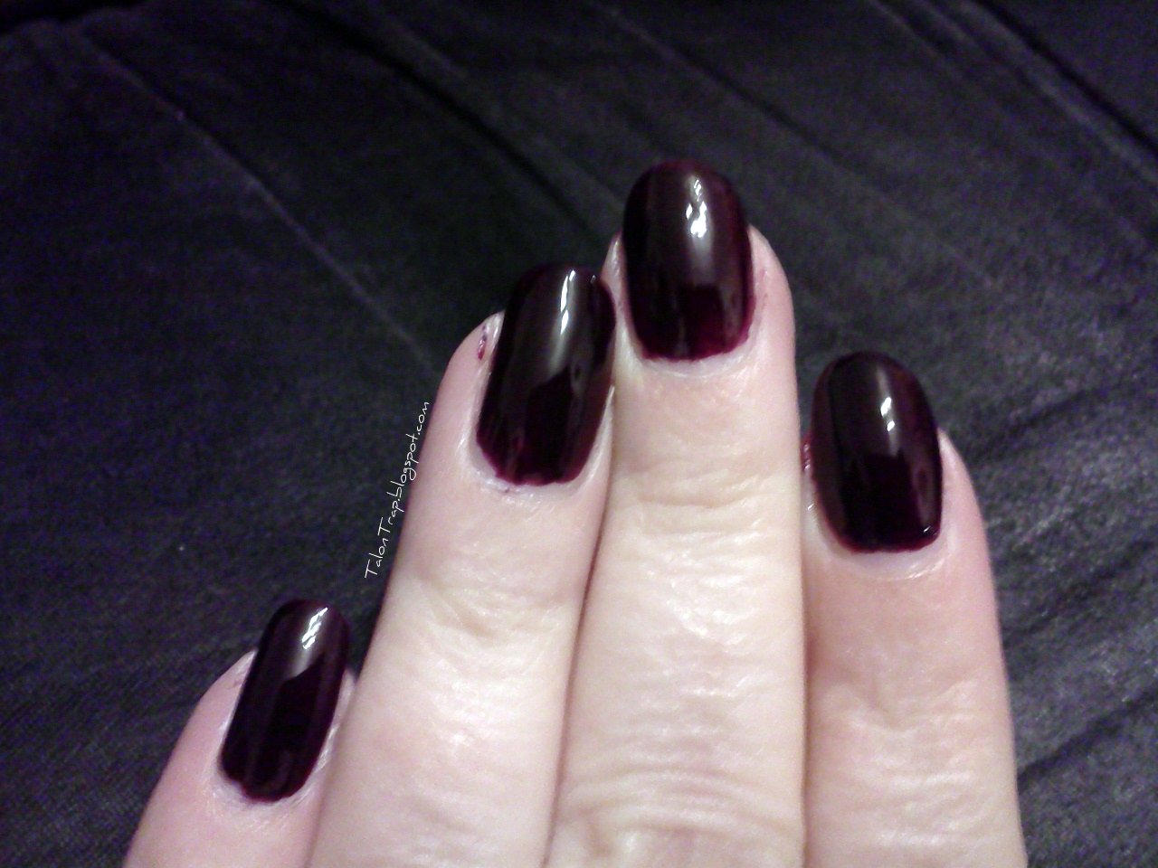
The nail polish, called "Let it Bleed", a Stones reference, is a deep red plum color. It's pretty and more purple than I imagined it would be. And I made a mess putting it on, clearly.

Sorry for the distortion. The picture software strikes again.
The label shot, which is never easy with those metallic stickers! AUGH!

This definitely has some brown in it, but I would call it a dark reddish plum. I don't know that you would really call this a jelly but it has a real jelly feel to it.


This is only two coats. I really recommend a third. This is on bare nails, which doesn't help, but while it evens out pretty well from just one coat, a third coat would be gorgeous. This is gorge? But a third coat would fix all those thin spots you can see here.

 It's described as a deep sanguine red...I still think this has too much brown and plum in it to be a red. Whatever you call it, it's pretty! and very wearable.

This has a complex scent to it? It's nice, fits the theme, and is still faintly there once the lacquer dries. It smelled kind of berry - woodsy - exotic to me.

Picking this up?

Happy Talons!!

Sunday, January 15, 2012

butter LONDON - Tramp Stamp

Tramp Stamp is a kind of classic butter. It's been around awhile and I never picked it up until just recently, when I got that order from last week's post. I had always liked it but there had always been other flashier colors to go for. I think this could become one of those go-to kinds of lacquers, the ones that you turn to when you just don't know what else to wear.

And I'm sure BMWWU would call it "liver". I don't care. Maybe I like liver color!

OK, this is a one coat picture and you can see, it's a bit more opaque than usual for a butter. At least this one isn't going to make you run for the hills on the first coat! Hold on for the Illamasqua I have coming up for that! This one isn't so bad, really. About what you might expect.

Tramp Stamp, as you can see, is a LOVELY muted purple cream which is not liverish!
The label shot! And I think still just one coat.

OK, two coats, no top coat. Wow. I did a really bad job painting! But look at those tidy cuticles. Good, easy to apply formula. And so opaque and great shine. I like it. It's dark but it's understated and it's one of those colors that should look good on about anyone.


I love the dirty plumminess of this color. It's very pretty and very kind of elegant. It would be more so if I had cleaned it up before I swatched it. I must have been getting tired. No excuse! Just look at the ring and pinky...they look good! I like it. I hope you like it, too!

Enjoy!

Happy Talons!

Monday, September 19, 2011

Illamasqua Vice - and a surprising comparison

Illamasqua Vice, my next offering from the Theater of the Nameless collection, is a lovely red plum. No, really. It's the color of a red plum. I really like it a lot. I'm oddly fascinated with it. It has the same rubberized look to it and I'm still loving it.

Isn't that pretty? It looks like one of those colors I would use to a nub from my Big Box of Crayola crayons. I have a lot of pics of this because I love the color, I love it on me...Why not swatch it into oblivion?

 Isn't that gorgeous? It's a plummy red...it's so pretty and look what it does to my skin! It brings out the alabaster, which I love. No. I do not tan. I don't care who doesn't like it.

It's a lovely creme and like the rest of this collection, it went on thickly, but easily. See how tidy the cuticles are? Once again, I'm not really that good. The polish was just easy to manipulate.

So...I'm looking at this and I'm thinking...this looks like a plummier version of Deborah Lippmann Single Ladies. Hmmm. I had to try it. Check this out!

Um, wow. They are definitely not the same color. However...If you want the shiny look, just flat prefer Lippmanns, or want something just a shade redder...Deborah Lippmann's Single Ladies will do ya for a color similar to Vice. Obviously, the index finger and part of the ring finger are Single Ladies. I have one more shot I think is pretty telling:


How about that? The Lippmann looks a lot richer here, but it does have the shiny finish and it's over Vice.

Surprisingly similar, don't you think? Do you think you'll pick up both? This was a shock. I think if I hadn't swatched both of these collections at the same time I would never have picked up on this. So interesting.

Happy Talons!